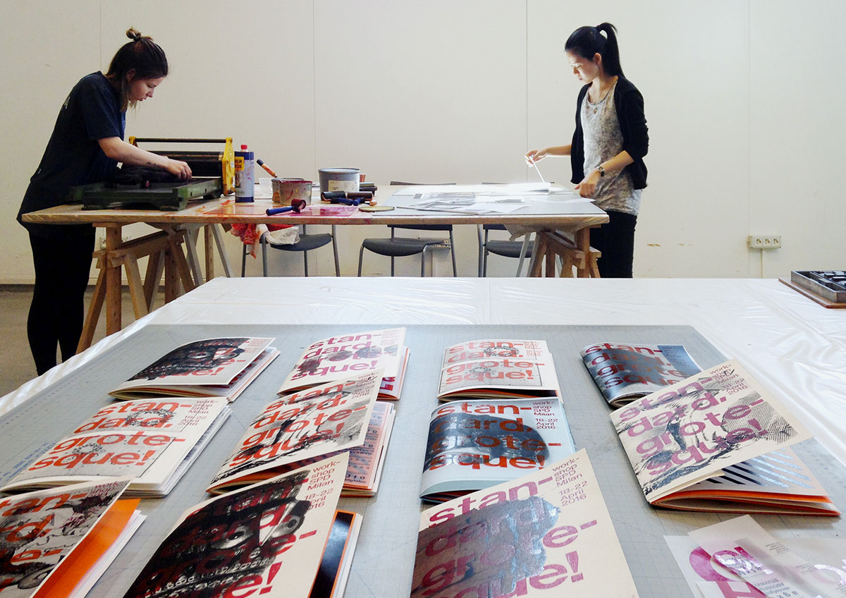
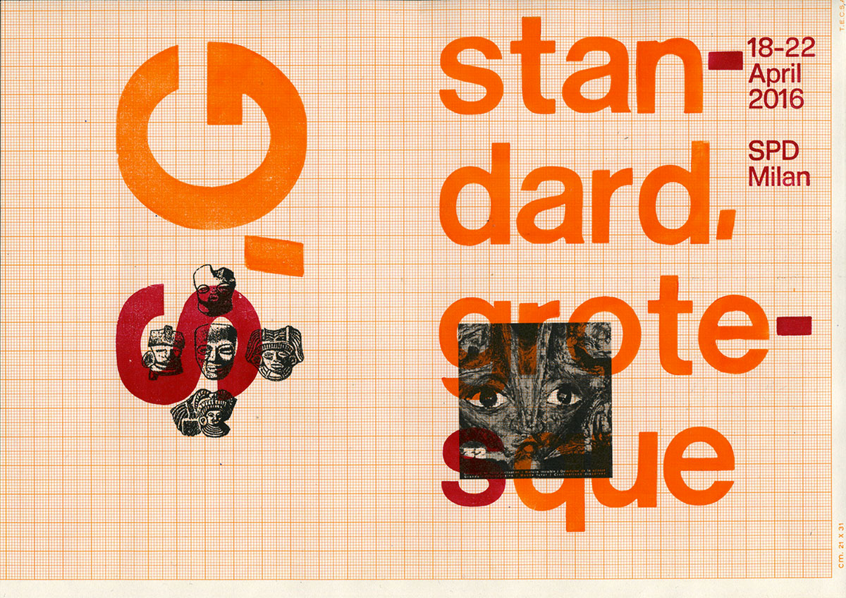
STANDARD, GROTESQUE. A LETTERPRESS WORKSHOP
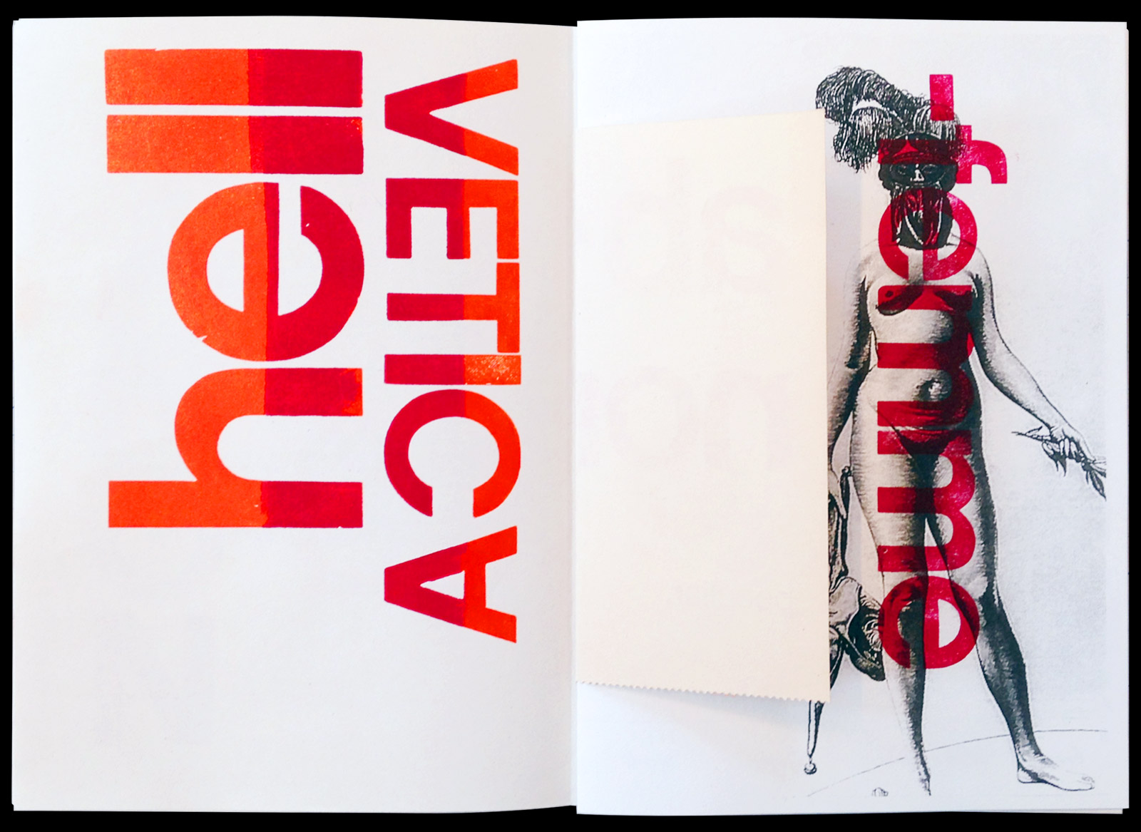
Since its release in 1957, Helvetica –formerly called Neue Haas Grotesk– has been hailed as the most perfectly ‘neutral’ typeface, establishing a standard within modernist visual communication.
The assumed ‘objectiveness’ of Helvetica and other akin mid-XXth century typefaces nevertheless contrasts with the term ‘grotesque’ –a trace of the bizarreness which was ascribed to the sans-serif typefaces when they first appeared back in the XIXth century.
Which role do standard forms and formats play within visual language? What kind of imagery does the grotesque category embrace today? How can we connect the ordinary and the unsightly, the norm and the whimsical?
2016
SPD Scuola Politecnica di Design
Milano IT
SPD Scuola Politecnica di Design
Milano IT

TYPE
Linea semibold 24 pt, lead type
Unknown neo-grotesque bold 8 Line Pica, wood type
Unknown neo-grotesque bold 15 Line Pica, wood type
Linea semibold 24 pt, lead type
Unknown neo-grotesque bold 8 Line Pica, wood type
Unknown neo-grotesque bold 15 Line Pica, wood type


BIBLIOGRAPHY
Tom Eccles and Maja Hoffmann (ed.)
Imponderable: The Archives of Tony Oursler
JRP | Ringier 2015
Experimental Jetset
Statement and Counter-Statement: Notes on Experimental Jetset
Roma Publications 2015
Geoffrey Harpham
The Grotesque: First Principles
in The Journal of Aesthetics and Art Criticism 34/4, Summer 1976
Gary Hustwit (directed by)
Helvetica, 2007
David Jury
Letterpress: The Allure of The Handmade
RotoVision 2004
Gabriele Mazzotta (ed.)
Visioni del fantastico e del meraviglioso. Prima dei surrealisti
Fondazione Antonio Mazzotta 2005
Lars Mueller and Victor Malsy (ed.)
Helvetica Forever: Story of a Typeface
Lars Mueller 2008